

Components and params
A component is a design you save once and use many times: a stat card, a lower third, a chart row, a labelled callout. Every copy you place stays linked to the saved component — same design everywhere — while parameters let each copy carry its own content: this card says “Acme”, that one says “Initech”, and neither of them stopped being the same card.
Reach for a component the moment you catch yourself duplicating a group and editing the text by hand. Three near-identical cards on one canvas is the tell.
Save a selection as a component
Section titled “Save a selection as a component”Build the design as a group — a card is typically a rounded rectangle with a few text layers inside. Select the group and press Save as component in the properties panel’s Actions section.
The dialog asks for a few things:
- Name and Description — the description doubles as context for AI agents, so a sentence like “dark stat card with a coloured accent bar” pays off later.
- Category — card, button, badge, icon, shape, or logo. Purely for organising the picker.
- Scope — Project keeps the component to this project; Workspace makes it available in every project in your workspace.
- Parameters — the interesting part, below.
If the group is animated, the animation is saved with it — every copy you place later animates the same way.
Choosing the parameters
Section titled “Choosing the parameters”Each + Add parameter row exposes one field of one inner layer so it can be changed per copy without touching the design:
- Name it — “Company name”, “Accent”. This becomes the field’s label everywhere it appears later.
- Pick the layer — the picker lists every layer in the group, each with a preview of its current content, so “which Text is this?” answers itself.
- Pick the property — for a text layer: its Text, Text colour, or Font size. For any other layer: its Fill colour.
The layer’s current value is shown in the row and becomes the parameter’s default — what a copy shows until you override it.
Everything you don’t expose stays fixed. That’s the quiet superpower: the design — spacing, fonts, corner radius, animation — is locked in the component, and only the fields you chose can vary. A component saved with no parameters is still useful; it’s just the same everywhere.
Insert and reuse
Section titled “Insert and reuse”Open the Media & Components menu in the canvas toolbar and choose Components… — the picker shows every component this project can see, project-scoped and account-scoped together. Click one and it lands on the canvas, centred, at its natural size.
Components also arrive from outside the canvas: the assets view can convert an uploaded SVG into a component, and the Mixture Chrome extension can capture an element from any web page and paste it in as one.
Every placed copy — an instance — is a live link, not a paste. All instances render from the one saved component, so a change to the component shows up in every instance across the project at once, while each instance keeps its own position, timing, animation overrides, and parameter values. Deleting a component breaks its instances (the panel will tell you the source is gone), so treat deletion as the destructive act it is.
For the curious: what an instance looks like in the project JSON
An instance is one small layer whose src points at the component, plus a
params bag for its overrides:
{ "id": "intro-card", "type": "rect", "src": "component://<component-id>", "x": 960, "y": 540, "params": { "companyName": "Acme", "accent": "#8b7dfb" }}The keys in params are the parameter names from the save dialog,
camel-cased (“Company name” → companyName). At render time Mixture expands
the reference into the component’s full layer tree and substitutes the
params into the fields you exposed. Anything you omit falls back to the
parameter’s default.
Edit params per instance
Section titled “Edit params per instance”Select an instance and the properties panel shows a section named after the component, with one field per parameter — a text box, a colour well, or a number, matching what you exposed. Type a new name, pick a new colour, and only that instance changes.
Two rules keep this predictable:
- Params belong to the instance. Ten instances can show ten different names; editing one never touches the others.
- The design belongs to the component. Anything you didn’t expose as a parameter can’t drift between instances.
If you select an instance and the section says the component has no parameters, re-save the source group and add some — the existing design isn’t lost, you’re just declaring which fields should be editable.
Sizing: use Scale, not width and height
Section titled “Sizing: use Scale, not width and height”This is the one that trips people, so plainly: an instance has an intrinsic size, like a placed video. Its width and height fields are ignored by design. To make an instance bigger or smaller, use Scale in the properties panel — the whole design scales as one, so text wrapping, spacing, and stroke weights stay exactly as designed instead of squashing.
The same rule applies to formulas: binding width or height on an
instance does nothing — bind scale instead.
Components + data: the killer combo
Section titled “Components + data: the killer combo”Components pair with data-driven video, and together they’re the fastest way to build a card wall, a leaderboard of rich rows, or any “same design, different content, one per row” layout.
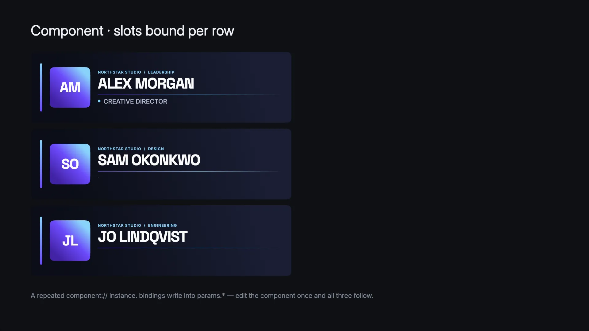
The idea: repeat an instance over data rows, and drive its params from the columns. Design the card once, save it with parameters, place one instance, give it a repeat — and every row of your spreadsheet becomes a fully designed card with its own content. Add a row to the data and a new card appears; restyle the component and the entire wall updates.
Setting the repeat works exactly as the
editor walkthrough shows — right-click
the instance, choose Repeat…, pick your dataset. Driving params per row
is done with bindings on params.* keys — today that’s a job for the
project JSON or, more comfortably, an agent:
{ "id": "card", "type": "group", "src": "component://<component-id>", "repeat": { "from": "asset://<dataset-id>", "as": "row" }, "bindings": { "params.companyName": "= row.name", "params.accent": "= row.tone" }}Each copy evaluates the formulas with its own row, so one binding fills
every card. Binding one params.* key leaves the sibling params you set by
hand alone. And because scale is bindable too, a card wall can size each
card by its data: "scale": "= 0.6 + row.weight * 0.4".
Two gotchas worth knowing before they cost you an afternoon:
- Put the repeat on the instance, never inside the component. A repeat saved inside a component’s design renders one copy and warns — copies are made first, then each copy expands into a full instance. That ordering is exactly what makes repeating an instance work.
- Param keys must match exactly. A binding on a key the component never declared does nothing — the card just shows its defaults. When a wall of cards all look identical, check the key names first.
The data guide’s showcase builds this same way of thinking through worked examples, all from the same demo project.
One edit, every video
Section titled “One edit, every video”Because every placed copy stays linked to the saved component, the saved design is the single source of truth. Fix the lower third’s spacing or update the logo lockup once and the change reaches every use — without opening and re-editing the videos that use it. With Workspace scope that holds across your whole workspace: last quarter’s videos pick up the refresh the next time you open them, untouched.
Your brand as a library
Section titled “Your brand as a library”Take this to its conclusion and you get a brand system Mixture can build with: your real typefaces, logo, and palette as assets; your stat cards, lower thirds, quote blocks, and end cards as Workspace-scoped components with sensible parameters. That library is what makes agent-built video come out in your style — hand an agent a script and it composes from your components rather than inventing lookalikes, so the tenth video looks like the first.
To go one level up — the structure, pacing and rules of a whole video rather than a single element — those components become ingredients in a recipe.
Agents know components too
Section titled “Agents know components too”Everything on this page is also documented to agents.
Connect a coding agent and the live
documentation it fetches covers saving, instancing, params, the sizing rule,
and the data pairing — and the agent can list your components and read each
one’s exact parameter names, so it fills in params correctly instead of
guessing.
Which means the whole combo above is one sentence:
- “Save this card as a component with the name and the accent colour as parameters, then repeat it over my CSV — one card per row.”
- “Insert the stat-card component three times with our Q3 numbers.”
Agents are also nudged to prefer your saved components over hand-building lookalikes — so the more of your design language you save, the more on-brand everything an agent builds becomes.